Statistics I: Collection, Organization & Presentation of Data
Abdullah Al Mahmud
Invalid Date
Data Collection
Types of Data
- Qualitative
- Quantitative
Sources of Data
Primary: Obtained directly (not collected from someone else)
Secondary: Using pre-collected data from someone else/some organization
Example
A researcher buys data from BMD to build a model of rainfall behavior
A researcher runs an experiment to measure speed of light using a novel technique.
A researcher makes use of the data generated by the one in example 2
Method of Data Collection
Direct personal Inquiry
Indirect oral inquiry
Mail
Telephone etc.
- Each method has its own advantages and disadvantages;
Sources of Secondary Data
- Published: Journal, Newspaper etc.
- Unpublished: BBS, WHO, IMF, FAO, ICDDR,B
DIsadvantages of Secondary Data
- Purpose might be different
- Suitability
- Reliability
- Unit
Organizing Data
Tabluation
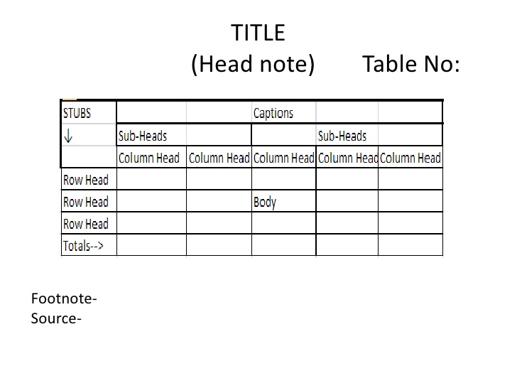
table
Data Classification
- Geographical
- Chronological
- Quantitative
- Qualitative
Example
Geographical
| Country | Bangladesh | USA |
|---|---|---|
| GDP(m) | 120 | 500 |
Chronological (Time series data)
| Year | 2015 | 2016 |
|---|---|---|
| GDP(m) | 120 | 500 |
Quantitative Classification
| Income level | 40,000-50,000 | 50,000-1,00,000 |
|---|---|---|
| Frequency | 120 | 34 |
Frequency Distribution
Three things required
- Range
- No. of classes (k) &
- Class Interval (CI)
Let k or CI & find the other
- \(CI = \frac{Range}{\text{Number of classes (k)}}\)
- \(\text{Number of classes, k}= \frac{Range}{\text{CI}}\)
- Sturges Method: \(k = 1 + 3.322 \space logN\); where N = no. of observations
Frequency Distribution Example
| No. of Surviving Plants | Frequency | Cumulative Frequency | Percentage | Cumulative Percentage |
|---|---|---|---|---|
| 20–29 | 3 | 3 | 3% | 3% |
| 30–39 | 14 | 17 | 14% | 17% |
| 40–49 | 12 | 29 | 12% | 29% |
| 50–59 | 8 | 37 | 8% | 37% |
| 60–69 | 18 | 55 | 18% | 55% |
| 70–79 | 10 | 65 | 10% | 65% |
| 80–89 | 23 | 88 | 23% | 88% |
| 90–99 | 12 | 100 | 12% | 100% |
| Total | 100 | 100% |
Insights on the next page
Key Insights
- In most schools (23), the number of surviving plants is between 80 to 89.
- Very few schools (3) have surviving plants in the 20–29 range.
- More than half of the schools (55%) have up to 69 surviving plants.
- A significant portion of schools (35%) report 70 or more surviving plants, with the 80–89 range alone accounting for 23%.
- The 50–59 range has relatively few schools (8%), creating a noticeable dip between the lower and higher survival groups.
Weight Distribution
| Weight (lb) | 110–119 | 120–129 | 130–139 | 140–149 | 150–159 | 160–169 | 170–179 | 180–189 | 190–199 | 200–209 | 210–219 |
|---|---|---|---|---|---|---|---|---|---|---|---|
| Frequency | 1 | 4 | 17 | 28 | 25 | 18 | 13 | 6 | 5 | 2 | 1 |
- Peak weight class: The distribution peaks at the 140–149 lb interval, with the highest frequency of 28 individuals.
- Central concentration: The majority of the data (70 out of 120, or 58.3%) lies within the 140–169 lb range, indicating a strong central tendency.
- Right-skewed tail: The distribution is skewed to the right. The frequencies decrease gradually toward higher weights.
- Low-frequency extremes: The extreme ends are very sparse. The lowest (110–119) and highest (210–219) weight classes each contain only 1 individual.
- Rapid drop-off: After the peak at 140–149, the frequencies decline steadily (28 → 25 → 18 → 13).
Messages by Teens
| Messages Sent Per Day | Number of Teens |
|---|---|
| 0–39 | 13 |
| 40–79 | 44 |
| 80–119 | 34 |
| 120–159 | 9 |
| 160–199 | 0 |
Total: 100 teenagers
- Most teens send 40–79 messages a day.
- Very few teens send 120 or more messages.
- The middle three groups cover almost everyone.
- Light texting is also uncommon.
- The distribution leans slightly to the heavier side.
Normal Distribution
| Height in cm) | 157 - 162 | 162 - 167 | 167 - 172 | 172 - 177 | 177 - 182 | 182 - 187 | 187 - 192 |
|---|---|---|---|---|---|---|---|
| Frequency (\(f_i\)) | 20 | 120 | 250 | 320 | 200 | 70 | 20 |
Graphs
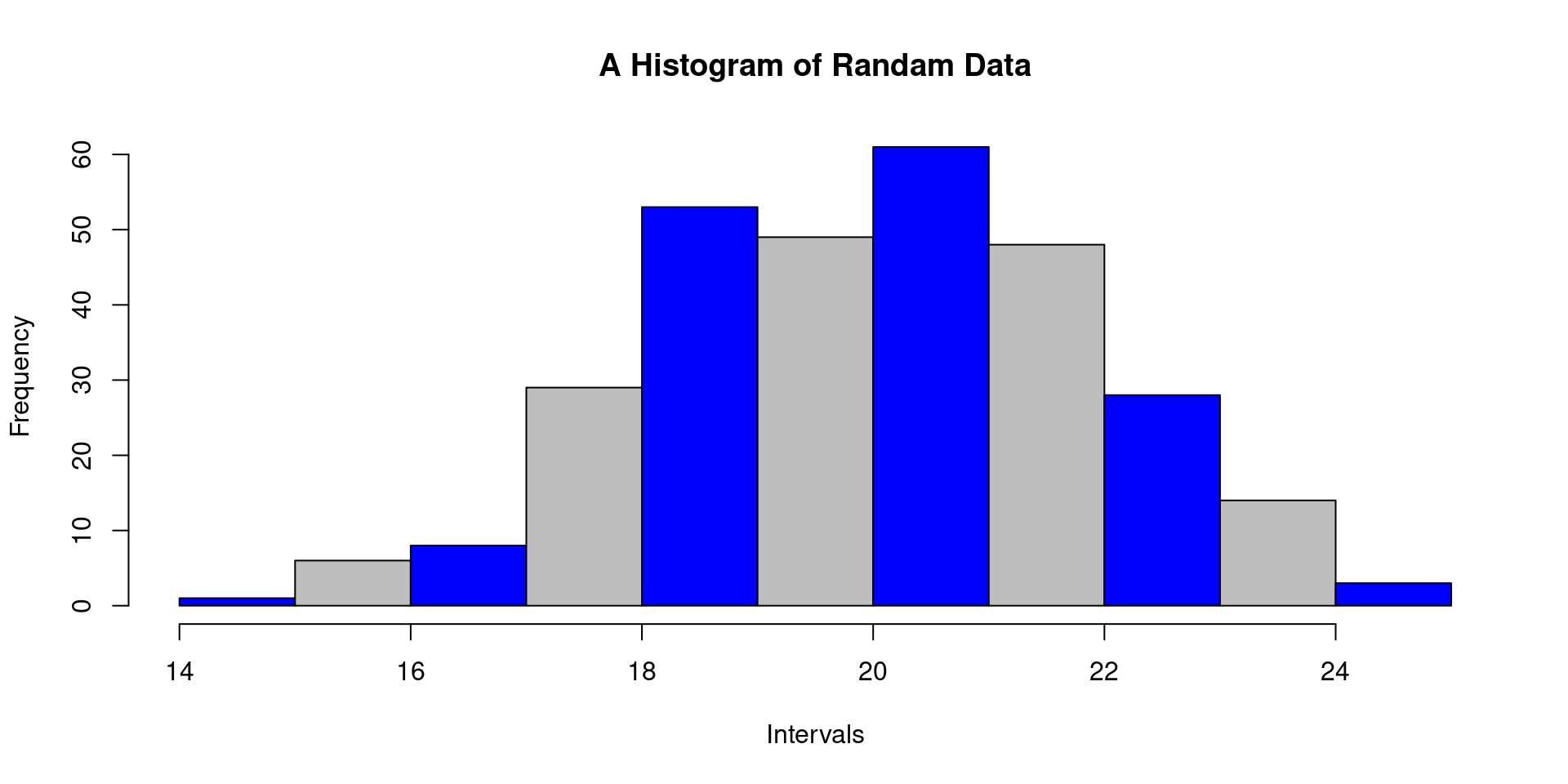
Histogram
- Inclusive vs exclusive
What does it tell us
Histogram (contd.)
Can these intervals be readily used?
(5-10); (10-15); (15-20)
(5-9); (10-14); (15-20)
If not, what should we do?
Stem and Leaf
- key in stem and leaf plot
- How to interpret stem and leaf plot
  The decimal point is 1 digit(s) to the right of the |

  0 | 1
  1 | 0246
  2 | 0567
  3 | 0
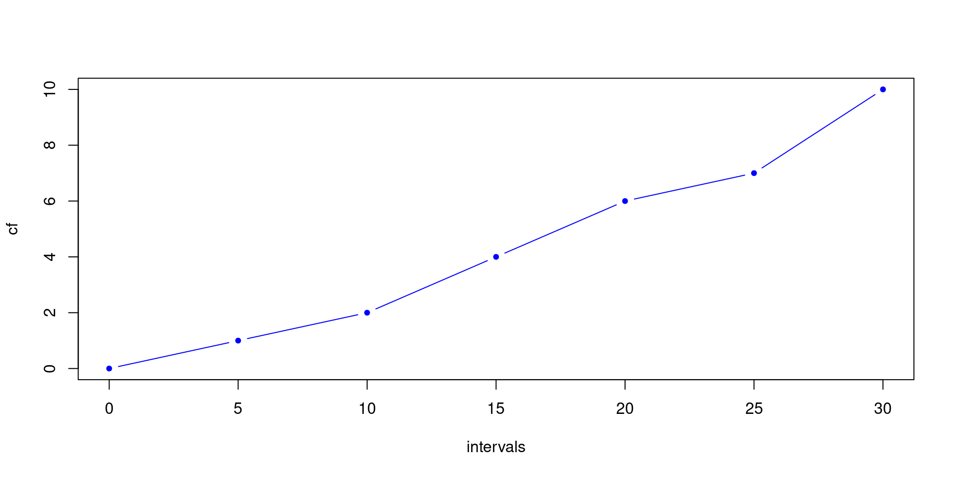
How to interpret cf and rf
| Class | Frequency | Cumulative Frequency (cf) |
Relative Frequency (rf) |
Cumulative Relative Frequency (crf) |
|---|---|---|---|---|
| 30-35 | 4 | 4 | 0.09 | 0.09 |
| 35-40 | 10 | 14 | 0.23 | 0.32 |
| 40-45 | 20 | 34 | 0.45 | 0.77 |
| 45-50 | 8 | 42 | 0.18 | 0.95 |
| 50-55 | 2 | 44 | 0.04 | 1 |
| n=44 | n=44 |
What Ogives tell us
Bar vs Pie
- When to use which?
- How to calculate angles?
- Can we draw on 180 degrees?
Draw Suitable Chart
Favorite colors of 30 individuals are noted down.
  Brown Red   Pink  Green Green Green Brown Pink  Brown Red

Brown Red   Green Pink  White Red   Brown Green White Brown

White Brown Pink  Red   White Brown Green Red   Pink  Red
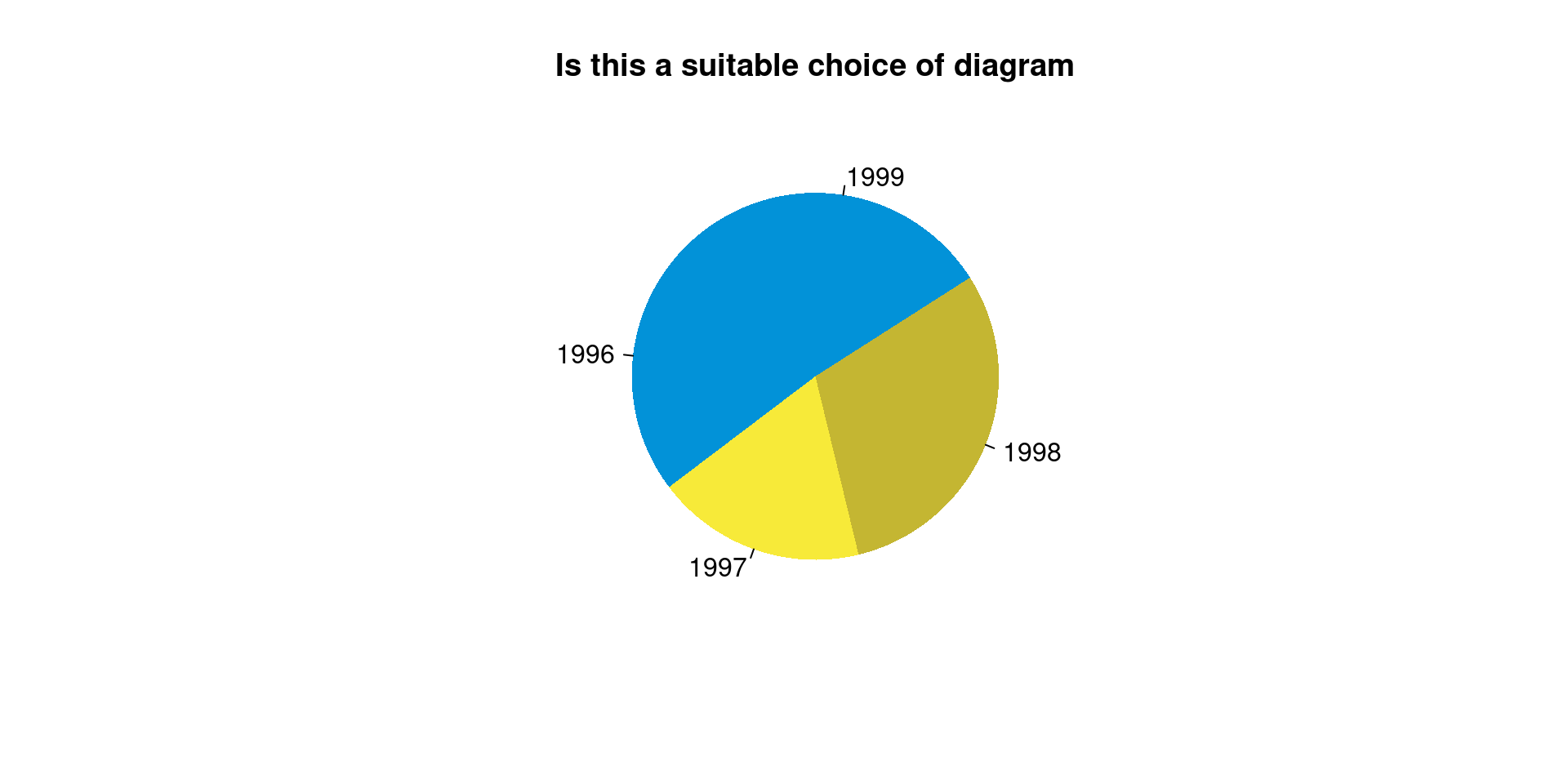
Choose Diagram
| year | Sales ($) |
|---|---|
| 1996 | 76 |
| 1997 | 58 |
| 1998 | 95 |
| 1999 | 85 |
| Category | Cost(Tk.) |
|---|---|
| House rent | 10,000 |
| Utility Bill | 3,000 |
| Telecom | 2000 |
Frequency Polygon vs Frequency Curve
- Curve: Smoothed corners
Bar Diagram vs Histogram
Example Charts
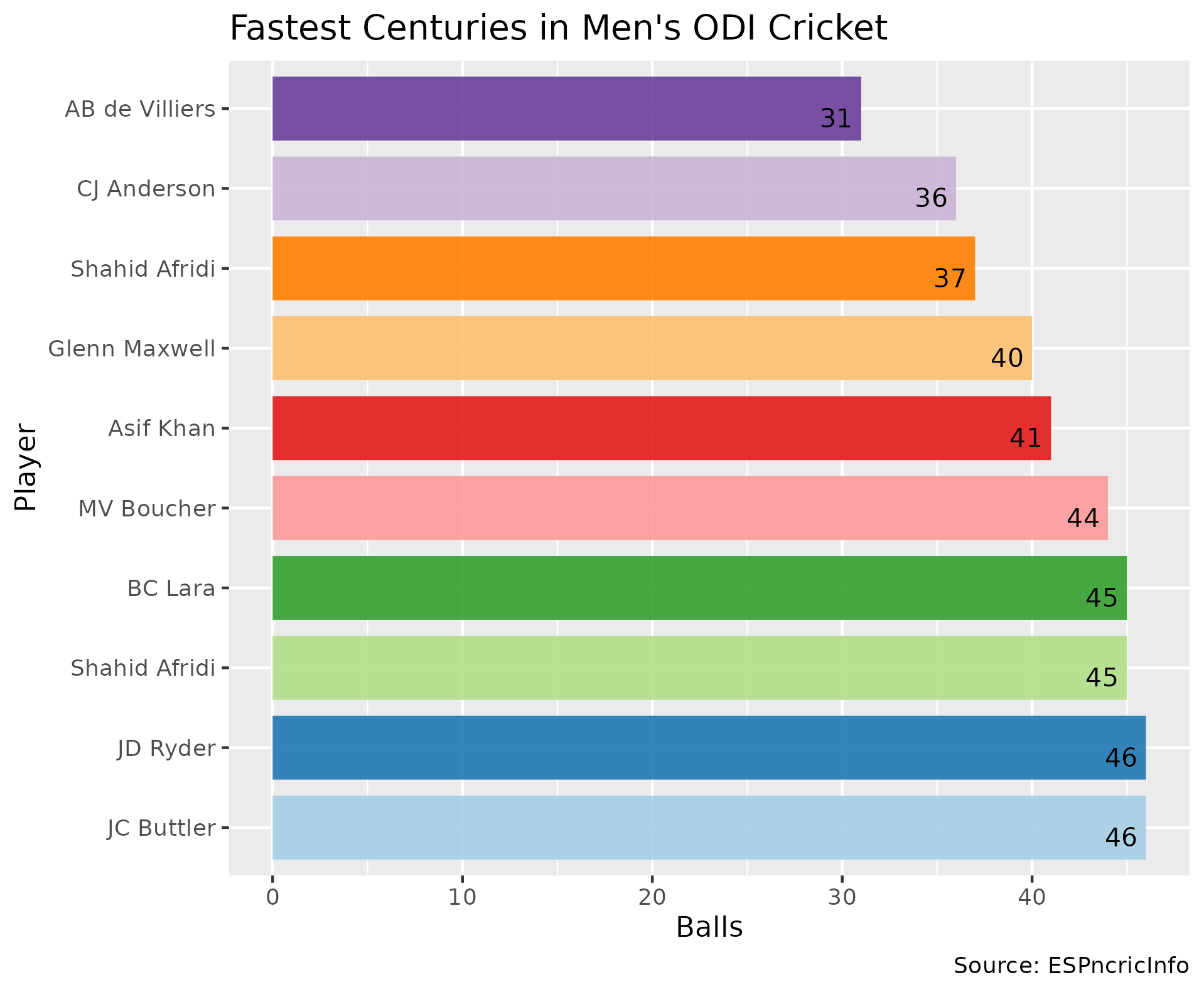
Bar Chart
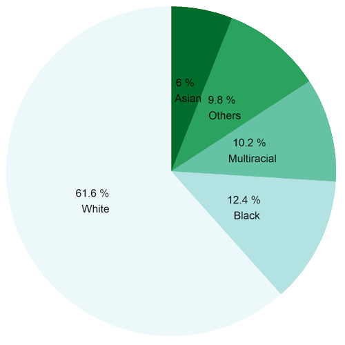
Pie Chart
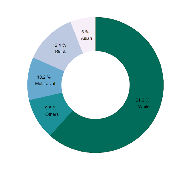
Donut Chart
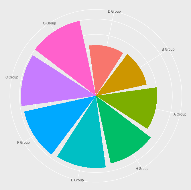
Rose Plot
Question Bank
Practice Online
Practice Collection, Organization, and Presentation of Data MCQs interactively (with instant feedback): Stat & Prob Quiz
- Pick Statistics I as subject and Collection, Organization, and Presentation of Data as chapter/topic.
Question Bank Archive

www.statmania.info | Abdullah Al Mahmud | Press space or arrow to change slides